Tuning Up the Car-Buying Search Experience for Consumers

My client for this project is one of the leading digital marketplace providers for the automotive industry, connecting car shoppers with sellers. Their online offerings have about 29 million unique users a month, and their mobile app is one of the top-ranking in the “Auto & Vehicles” category.
The challenge.
The client’s team launched a replatformed version of their iOS and Android apps, but noticed a subsequent drop in number of active app users.
While some of that drop was attributed to the deprioritization of certain features during the move to the new platform, user feedback also pointed to usability issues with the search feature—a key component of the user experience and a critical element of lead generation.
I engaged with the team to understand the search-related factors contributing to the drop, to make recommendations on how to improve the apps, and to work with the client’s research and design teams to create and execute on the new chosen direction for search and filter.
Key themes for this project.
Refreshing a core product experience (search + filters) for millions of users
Balancing business needs and user needs under tight constraints
Prioritization through research, ux auditing, and product analytics like sentiment and behavior
Emphasis on clarity, relevance, and hierarchy
The approach.
I gathered and reviewed a variety of qualitative and quantitative data in order to gain a holistic picture of the issues. This included:
Product analytics
In-app feedback via Apptentive
Competitive analysis
Stakeholder interviews regarding platform decisions for iOS and Android, plus differences and similarities with the web counterpart
Remote user research conducted using Usertesting.com
Several opportunities for improvement were found. For example, the new design led users to a filter page that did not provide information on number of cars in the filtered set, something that users often referred to as a key number for them to see in order to understand when they were done filtering so they could start reviewing search results.

This design used overlays on iOS and Android to provide filter options to consumers, without showing the total number of results that resulted from their choices. That total (for example, “Search 20) is a key piece of info for car buyers when they are deciding whether to commit that search or keep filtering. My research made it clear that the running total of results needed to be visible during all filtering choices.
What we created.
I worked closely with the client team’s designer to sketch and prototype alternative approaches to both iOS and Android designs. We also explored some of the opportunities for differentiation that had been uncovered during discovery: to allow for multiple makes and models to be included in the search.
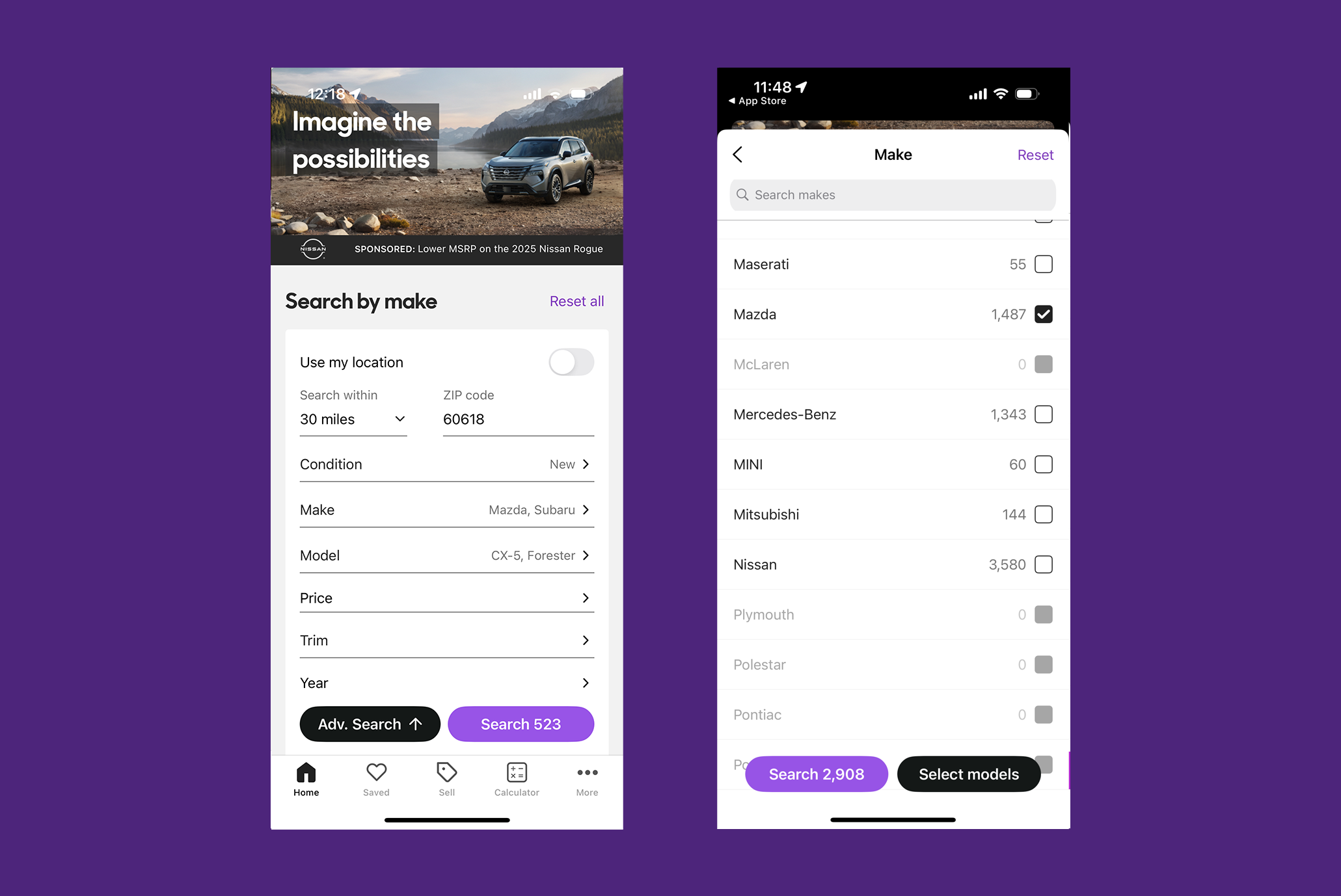
In the updated design, the number of filtered results shows on all filter selection screens.
We used Usertesting.com to review the possible approaches with shoppers, refining them into a fully designed feature set.
The Eight Bit team finished our work with the client team prior to launch, but it was released shortly after our engagement. The new feature is used by over a million users every day.